
We live in an era of pristine glass and luminous pixels. Every application, every webpage, every operating system adheres to a strict, minimalist orthodoxy of flat design, sans-serif fonts, and retina-sharp clarity. The screens we stare at for ten to twelve hours a day are engineered for maximum luminosity, mercilessly chasing away shadows and sharpening every edge until perfection becomes a kind of sterile prison. There is little texture to be found in this digital world—no grain, no powdery residue of ink, no gentle bleed of pigment that reminds us of the physical objects we once handled. It is in this context of profound visual uniformity that an application called Paperman arrives like a gentle, whispered rebellion. It is not trying to be flashy or disruptive; rather, it exists in stark contrast to the glittering emptiness of modern UI. Paperman is a digital ghost of the tactile past, a tool designed explicitly to reintroduce grit, fabric, and texture back into the monolithic spaces of our daily routines. When you first open the app, it takes you from the cold, harsh white of a backlit LED display and transposes you into the warm, forgiving light of a sunlit desk where a sheet of premium cotton bond paper sits waiting for your pen. It is an illusion, of course, but it is an illusion crafted with such care and fidelity that it feels almost like a physical intervention. It reminds us that our screens, though infinitely capable, are not the sum total of our sensory experiences. By making our digital workspace look like a piece of parchment or a page from a journal, Paperman bridges the chasm between the synthetic and the organic, offering an escape from the tyrannical shine of modern hardware. For those of us who miss the weight of a book or the slight crumple of a notebook, it is a subtle yet profound gift.
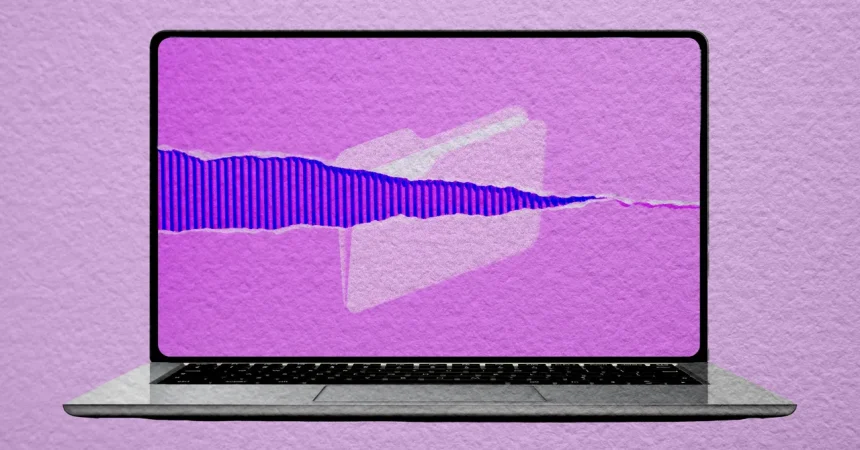
To understand Paperman, one must first understand the mechanics behind the magic—and the math behind the illusion. Thanks to the popularity of retro gaming, we have become familiar with “CRT filters,” which simulate the curvature, scanlines, and phosphor glow of old cathode-ray tube televisions. Paperman operates on precisely the same principle, but instead of simulating a 1980s television, it simulates the physical dimensions of high-quality paper. The application functions as a software-based overlay, a translucent layer that sits on top of every pixel your graphics card outputs. This layer is not merely a flat color; it is a deeply textured bitmap that mimics the irregular weave of cellulose fibers, the slight dimples of pressed cotton, or the rough, porous surface of artist’s paper. The Finnish development duo DoublOne crafted these textures with painstaking attention to detail, ensuring that the light interactions on your screen feel subtly diffused rather than directly transmitted. Where your screen normally offers a razor-sharp, infinitely uniform grid of backlight, Paperman’s overlay breaks up that uniformity, scattering the photons in ways that mimic how light hits a matte page. The result is that text appears softer, less aggressive, and somehow more physical. The harsh, neon glow of a laptop screen is replaced by a gentle, ambient luminescence that seems to emanate from the surface itself rather than from behind it. It is a profound perceptual shift. Your MacBook or PC monitor no longer feels like a window into a digital abyss; instead, it feels like a desk—a beautifully carved wooden desk, lit by a warm lamp, where a sheaf of pristine paper sits awaiting your words. This fundamental change in visual processing doesn’t just alter how you see the content; it alters how your eyes and brain interpret the strain of staring at a screen for hours on end.
The developers behind Paperman are not creating this texture overlay purely for nostalgia; they are also operating on a theory of cognitive decline. DoublOne has compiled a substantial page of academic research on their website, linking to studies that explore the relationship between reading, fatigue, and physical media. The general consensus in that research is that matte surfaces and paper texture help reduce visual fatigue, making long reading sessions more comfortable than they are on glossy, high-contrast screens. However, the developer Zoe Kilperti, who comprises half of DoublOne, is refreshingly honest about the limitations of their own product. In an interview, she acknowledges that a lot of the research is specifically about the physical act of reading on paper, and that they aren’t entirely sure that a digital simulation can truly replicate those exact physiological benefits. She points out that paper’s texture breaks up harsh light, softening sharp edges in a way that modern displays—which are “intensely uniform, razor-sharp grids of backlight”—simply cannot naturally match. This is where Paperman steps in, attempting to force the digital media to behave like the physical. But there is perhaps a deeper, psychological dimension at play here. The human brain craves texture as a way to anchor itself in reality. When we see a smooth, featureless screen, our eyes have nothing to latch onto, nothing to ground the information in a spatial context. Paperman provides those anchors. It introduces micro-variations in luminance and tone, giving the eyes a rich landscape to traverse. This is a clever and deeply humanized approach to problem-solving: rather than simply telling the user to “look away” every twenty minutes, it makes the act of looking far more tolerable. The placebo effect can’t be ignored, either. Because we believe the texture is helping, our eyes relax, our twitchiness subsides, and we find ourselves reading more slowly, more deliberately, more peacefully. Kilperti’s humility—admitting the science isn’t certain—is precisely what makes the app trustworthy. It isn’t selling a cure-all; it is offering a sensory reprieve, a quiet mechanical concession to our tired eyes.
The aesthetic journey of Paperman is where it truly shines, offering a variety of tactile experiences that range from the starkly modernist to the whimsically medieval. The app comes pre-loaded with a spectrum of textures, each carefully engineered to evoke a different mood. The “Classic Matte” setting feels like the default paper of a high-end laser printer, subtly off-white with a fine, barely perceptible tooth that reduces glare while maintaining a clean, professional feel. Conversely, “Sunbaked Parchment” is an exercise in time travel, a warm, honey-hued surface dotted with the faint, irregular mottling of aged animal hide, making your spreadsheet feel like a treasure map. However, the recommended default, and the one I find myself immediately favoring, is “Whisper Weave.” This texture mimics the luxurious, slightly bumped surface of linen-cotton stationery, a fabric that traps tiny pockets of air and scatters light in a gloriously diffuse manner. Whisper Weave adds a level of depth that is almost tactile; you catch yourself wanting to reach out and touch the screen to feel the fibers. Crucially, Paperman allows you to adjust the intensity of this overlay effect with a simple slider. On the lowest setting, it is almost imperceptible, merely removing the harshness from the bright whites. On the highest setting, it becomes a dense, grainy veil, firmly establishing the illusion that you are looking at a physical object. I absolutely recommend spending a few minutes adjusting this intensity to suit your personal threshold for visual grit. For me, a medium-high setting is perfect for a rainy afternoon of deep reading. The screen no longer glares; it glows gently, like a lamp shining through a translucent sheet of vellum. It transforms the experience of composing a digital letter or editing code into something more akin to drafting a manuscript on a porch, inviting you to slow down and savor the process.
Yet, for all its charms, Paperman is not a universal panacea for every pixel on your monitor. It is a text-first tool, and its strengths shine brightest when the screen is dominated by words. When I am writing this article, reading a PDF, or scrolling through a dense research paper, the paper texture works magic, calming my eyes and preventing the screen from feeling like a blinding surgical light. However, the overlay is indiscriminate: it affects everything on screen, including photographs, videos, and even graphically intensive games. If you try to watch a cinematic scene in a movie, you will suddenly see the fine grain of the paper texture creeping over the actors’ faces, diluting the shadows and muting the vivid colors. Graphic designers who need pixel-perfect color accuracy for their work will find that the texture fundamentally alters their perception of the image, making it impossible to judge color grading or fine details. This is a known limitation, and DoublOne has thoughtfully built in robust mechanisms to counteract it. The application allows you to set specific per-app exceptions. If you open Adobe Photoshop, Premiere Pro, or a full-screen video player, Paperman will instantly vanish, restoring your screen to its pristine, sterile default. This ensures that you get the therapeutic comfort of paper for your working sessions, but you never have to sacrifice the fidelity of your visual media. For those lucky enough to use multiple monitors, Paperman offers yet another layer of granular control. You can activate the filter on your secondary monitor—perfect for keeping a reference document open—while leaving your primary monitor untouched for editing or design work. Finally, and most importantly, the app integrates with custom keyboard shortcuts. You can assign a single key combination to toggle the effect on and off instantly. This is absolutely essential; sometimes you need that brief, unfiltered blast of clarity to see what the world actually looks like, or you simply want to catch a glimpse of a dynamic GIF without it being woven into a tapestry. Having the flexibility to flip between the two states is what elevates Paperman from a gimmick to a genuinely useful utility.
Ultimately, what makes Paperman so compelling is not the specific texture it applies, but what that application represents in the broader narrative of our relationship with technology. For decades, the tech industry has pushed relentlessly toward cleanliness, minimalism, and infinite sharpness. Screens have become thinner, pixels have become denser, and interfaces have been stripped of any ornamental complexity. We have been told, implicitly, that this visual austerity is synonymous with efficiency and modernity. But as we sit in darkened rooms, bathed in the harsh glow of our LED monitors, a growing unease has taken root. Our eyes ache, our attention fractures, and we secretly long for the imperfect, the tactile, the warm. Paperman is a deliberate, loving rebellion against that orthodoxy. It acknowledges that we are not cyborgs; we are biological creatures who evolved under the gentle, diffuse light of the sun, staring at leaves, wood, and bark. By reintroducing the visual grammar of paper, the app taps into a primal comfort that no amount of bezel-less design can provide. It does not erase the digital; it masks it in a familiar skin. It makes your computer feel less like a machine and more like a bookshop, a library, or a writer’s study. The developers’ honest uncertainty about the science, their subtle humility, only enhances this humanized charm. They don’t claim to cure digital eye strain; they simply offer a veil of calm, a chance to soften the stark edges of our digital lives. And in that softness, we find ourselves writing longer, reading deeper, and feeling less drained at the end of the day. Paperman is a small, quiet application, but it is a profound testament to the human need to hold onto the physical, even as we migrate entirely into the virtual. It is a fragile bridge between the world of ink and the world of code, and for those of us who miss the rustle of pages, it is a sanctuary of texture in an increasingly frictionless world. It is, in essence, a digital hug—a gentle, pixelated embrace that reminds us our screens, for all their cold perfection, can still feel a little bit like home.