

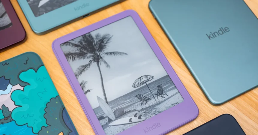
Color has always been a careful, somewhat conservative game for hardware makers. Most people, the thinking goes, reach for black or white, with any adventurous shade accounting for only a small slice of sales. Keith, the color expert referenced in this story, puts that number at roughly 15 to 20 percent for alternative colors. So when Amazon decided to release a Kindle in matcha green, the expectation was probably that it would be a nice little accent for the lineup, a way to catch a few extra eyes without changing the world. Instead, that matcha green model captured a stunning 55 percent of sales, reversing every assumption about what e-reader buyers actually want. It turns out that people were hungry for something warmer and more distinctive, something that didn’t look like another cold slab of technology. The success wasn’t random. Amazon had been paying close attention to cultural currents: matcha was surging as a flavor in drinks and desserts, and the company noticed that the BookTok community was thriving in coffee shops, where matcha lattes are practically a uniform. In other words, the color wasn’t just a color. It was a way of saying, this device belongs in your hands, in your favorite café, in your cozy reading ritual.
That same cultural instinct now leads to ube, a soft purple shade inspired by the popular Filipino yam of the same name. If matcha was a surprise hit, ube is being positioned as the next chapter in that story. Chris Green, Amazon’s vice president of design, explains that the company has been tracking food trends for years, and ube exploded about two years ago, growing 200 percent year over year. That’s an enormous jump, and it signals more than just a passing taste for purple food. Ube has become a symbol of comfort, nostalgia, and aesthetic pleasure, appearing in cakes, ice creams, and lattes across social media. It’s also visually stunning, with a soft, almost ethereal lavender tone that feels both playful and calm. Green is confident enough to say, “We expect it to do far better than the matcha.” That’s a bold statement, but the reasoning is grounded in the same logic that made matcha work: people are not just reading on their Kindles; they are living with them, carrying them around, photographing them, and making them part of their personal style. A color like ube acknowledges that an e-reader can be as expressive as a favorite sweater or a tote bag. It’s not just functional. It’s emotional.
Yet the thoughtful design behind the new Kindle goes far deeper than surface color. The way the device is manufactured has been completely reimagined, and the results are genuinely impressive in an age when we rarely ask how our gadgets are made. Traditionally, an aluminum device frame like the one on an iPhone or MacBook is milled from a solid block of aluminum. That process works, but it’s wasteful and slow. It consumes enormous amounts of water, produces a lot of scrap material, and can take hours to machine a single body. Amazon chose a very different path for the Kindle. Instead of carving away material, they stamp a flat sheet of aluminum and then use a forge to press it down, forming the backplate and sides in a matter of seconds. It’s a bit like using a giant cookie cutter and a metal press rather than sculpting from a block of stone. The savings are dramatic: less water, less energy, less wasted metal, and a far smaller environmental footprint. This matters because the whole point of an e-reader is to replace physical books, and yet every device still carries its own ecological cost. Amazon says the new Kindle’s carbon footprint is now equivalent to that of 11 hardcover books. That’s not zero, but it’s a meaningful reduction, and it shows that sustainability doesn’t have to mean sacrificing quality or durability.
This manufacturing shift also changes how the device feels in your hand, and for Green, that’s one of the most important aspects of the entire project. He talks about density, which is a scientific way of measuring how much mass is packed into a given volume. The average human body has a density of about 1 gram per cubic centimeter. An iPhone, by comparison, is around 2.2 grams per cubic centimeter, which is why it can feel heavy and dense in your palm. The new Kindle sits at roughly 1.2 grams per cubic centimeter, much closer to the density of the human body. That may sound like a niche engineering metric, but it has a profound effect on how the device feels during extended reading sessions. A lower density means the device seems to melt into your hand rather than fighting against it. It doesn’t feel like a heavy object pressing into your fingers after an hour. Instead, it feels lighter, more natural, almost organic. Green describes this as making the hardware “disappear” during prolonged use. He’s not talking about literal invisibility, of course. He’s talking about the kind of experience where you stop noticing the object in your hands and simply fall into the story unfolding on the page.
For Green, who has spent 19 years at Amazon designing nearly all of the company’s hardware, this obsession with density is part of a larger mission. He is openly embarrassed by the Fire Phone, the famously failed Amazon smartphone, and that embarrassment seems to have shaped his later philosophy. He doesn’t want to build devices that demand attention, that show off, or that make you constantly aware you’re using a piece of technology. He wants the opposite. He says, “I truly want people to never think about the Kindle. I just want them to think about the magical world that the author has created inside of this device.” That is a remarkably humble goal for a hardware designer, but it’s also a very wise one. A physical book is a quiet object. It doesn’t buzz, flash, or ask for your attention beyond the text on its pages. It disappears into the background of the reading experience, and that’s precisely what makes reading so immersive and calming. By chasing a density closer to the human body, by choosing colors that feel warm and inviting, and by redesigning the manufacturing process to make the device more sustainable, Green and his team are trying to build a piece of hardware that honors that analog calm rather than disrupting it.
In the end, the new Kindle is a reminder that great design is often about subtraction rather than addition. We live in a world of relentless stimulation, of screens that glow, buzz, and demand our attention at every moment. The Kindle stands against that tide. It’s a device that doesn’t want to be noticed, a piece of technology that aims to disappear into your hands and your routine. The matcha green success and the anticipated ube wave are part of that vision, because color can make a device feel personal and warm, like a favorite book cover rather than a cold appliance. The efficient manufacturing and the careful attention to density are equally important because they make the device lighter on the earth and in your hand. Chris Green has spent nearly two decades designing hardware, and with the Fire Phone in his past, he knows how easy it is to get lured into spectacle and flash. But the Kindle represents a different path, one where design serves the experience rather than the ego. The goal isn’t to impress you with engineering. The goal is to let you forget about the engineering entirely and simply get lost in a story. And if that means painting an e-reader the color of a purple yam because people are baking ube cakes and posting about them, then there’s a strange kind of beauty in that too. It’s a way of saying that technology can be gentle, that it can bloom with culture and taste, and that even in the age of endless digital noise, we still long for a quiet, simple, almost invisible portal into the magical world of a good book.