

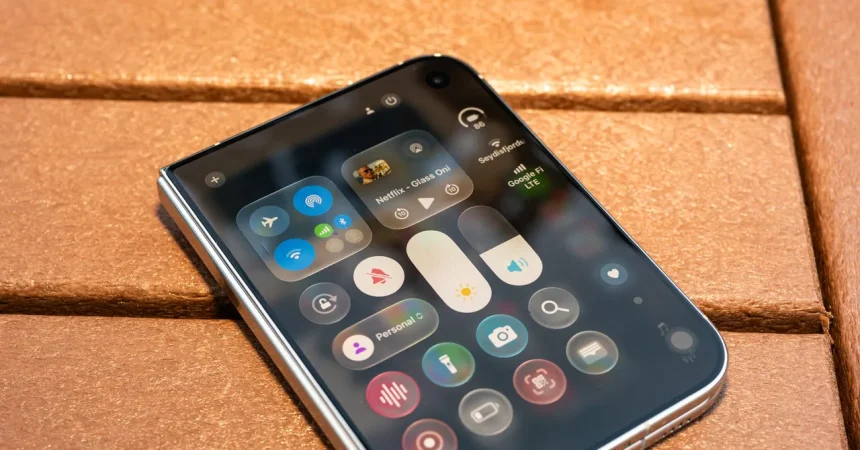
There is a particular kind of magic in an Apple keynote when the software demo stops being about wallpapers and widgets and becomes a quiet confession of what’s coming next. This year, that moment arrived almost in passing. During the usual parade of OS updates and feature refinements, Apple showed iPhone apps running on iPads and Macs, and something strange caught the eye. The app windows could be resized into a shape that was oddly specific—almost like a passport lying flat on a table. It wasn’t the tall, slender rectangle we’ve all grown used to after a decade of phones stretching ever skyward. It was wider, squatter, more grounded. And if you had been following the rumors about Apple’s first folding device, you recognized it instantly: this was the rumored inner display of the so-called iPhone Duo, the foldable iPhone that Apple has never officially acknowledged but has clearly been working on for years. In that single animation, Apple didn’t just hint at new hardware; it hinted at a new way of thinking about the phone itself. The Duo’s display, when opened, defaults to landscape, much like an iPad Mini. It is a deliberate rejection of the vertical bias that has dominated smartphone design for years. It is a screen built for two-page spreads, for reading, for multitasking, for holding in two hands like a tiny notebook. And the fact that Apple chose to reveal this through a software resize behavior, without ever saying the words “folding phone,” tells you everything about how carefully the company is managing this transition. They are preparing us, gently and deliberately, for a device that will ask us to rethink what a phone can be. It is the kind of foreshadowing that Apple does better than anyone else: a clue hidden in plain sight, waiting for the people who are paying attention.
Apple being Apple, it wants to avoid the jolt that comes when you unfold a device and suddenly feel as if you’ve been transported to a completely different machine. On many rival foldables, the transition between closed and open is jarring. Apps stretch awkwardly, controls scatter, and the whole experience feels like two screens taped together rather than one device that happens to bend. The Duo is designed to be the opposite. As Molly Anderson, Apple’s vice president of industrial design, put it during the September keynote: “To achieve this continuity, we designed iPhone Duo around a consistent aspect ratio that is the same across both displays.” That sentence is dense with meaning. It means the hardware itself is built around a single proportional language, so when content moves from the outer screen to the inner canvas, it doesn’t have to be reimagined from scratch. It simply scales, slides, and settles into place. But the hardware is only half the story. The software—rooted in Liquid Glass, the design language Apple introduced last year—is what sells the illusion. The most arresting element is a flowing animation that makes interface elements appear to drift seamlessly from one display to the next, like water finding its level. It’s the kind of flourish that feels inevitable in hindsight but is actually extraordinarily difficult to pull off. Naturally, it has already caught the attention of designers in the Android world, who are now busy being “inspired” by it. Yet the deeper point isn’t the animation itself; it’s the underlying idea that the interface is a continuous surface, not a collection of screens. Liquid Glass gives Apple a way to make that continuity tangible, to make the folding feel less like a mechanical trick and more like a natural property of the device. You don’t have to understand the technology to feel it. That’s the trick. The best interface design is invisible, and Liquid Glass, at its best, is exactly that.
Perhaps the most subtle but important shift is where things live on screen. Liquid Glass freed Apple from the old assumption that essential controls must always sit in the same familiar places, like a toolbar across the top or a row of icons along the bottom. On the Duo, that freedom becomes tangible. When the phone is open, the controls sit along the side, in a consistent vertical strip that feels natural for two-handed use. When you close the device and switch to the outer display, those controls stay put, preserving their position so your muscle memory doesn’t have to start over. Reorient the device—turn it sideways, flip it around—and everything glides into the most appropriate spot for the new orientation. It’s a small thing, but it changes everything. It means the interface is no longer a rigid frame imposed on content; it becomes a responsive layer that adapts to how you’re holding the device, what you’re looking at, and what you’re trying to do. This is what designers mean when they talk about form following function. The form of the Duo—its wide, squat, passport-shaped canvas—dictates a different kind of interface, and the interface, in turn, makes the form feel logical rather than gimmicky. Liquid Glass isn’t strictly necessary to make the Duo work; you could build a foldable with more traditional UI conventions and it would probably function fine. But the two feel made for each other. Liquid Glass finally has a device that fully expresses its philosophy. And with Apple’s other refinements, the design language is starting to make sense elsewhere too—on the Mac, on the iPad, even on the familiar iPhone, where it had initially felt like an unnecessary facelift. On the Duo, it feels less like a skin and more like a skeleton, less like decoration and more like structure. That’s a big step forward for a design language that, when it was first introduced, felt confusing to many people. It takes time for a new aesthetic to become natural, and the Duo is the clearest sign yet that Apple is willing to give it that time.
How much of this synergy is intentional is hard to say. Apple’s product cycles are so long, and its supply chain so secretive, that pure coincidence seems unlikely. It’s more plausible that Liquid Glass was always being developed with a foldable future in mind, even if the exact shape of that future was still in flux. And even if the design language wasn’t created specifically for the Duo, it has adapted to it beautifully. That’s the mark of a mature design system: it doesn’t need to be rewritten for every new product; it bends. Liquid Glass feels more considered now than it did a year ago. It’s increasingly tuned for individual devices rather than governed by a single “universal” aesthetic forced onto everything. On Macs and iPads, the revamp now looks less like a radical break and more like a love letter to Aqua, the watery interface language Apple introduced back in 2000. On the iPhone, it has settled down and become usable again. On the Duo, it’s a delight. That’s not to say everything is perfect. McCarthy, a designer and critic who has been following Apple closely, puts it well: “There’s some weirdness that hasn’t been fully resolved, and there needs to be a consistency to all these materials or the metaphors break down. But overall, Liquid Glass is vastly improved.” That’s a fair assessment. The glassy translucency, the depth, the blur—these materials need to behave consistently across apps and devices, or the entire metaphor of a liquid interface starts to feel like a gimmick. When it works, it’s invisible. When it doesn’t, it’s exhausting. The Duo, with its continuous displays and flowing animations, is the first device where the metaphor really has a chance to shine, because the hardware and software are so closely aligned. But the proof will be in the details, in the apps that get it right and the ones that don’t. The design language is young, and it is still evolving. The Duo may be the catalyst that helps it mature, or it may be the test that reveals its limits. Either way, it’s an exciting moment.
It’s also worth remembering that the Duo is not just a new piece of hardware; it’s a new kind of canvas, and canvases take time to paint on. Developer Steve Troughton-Smith, who has long been one of the most thoughtful voices in the Apple community, made exactly this point: “For some iPhone apps, even with keen developers, it will take six months to a year of work to properly support iPhone Duo. A lot of developers are still trying to finish the Liquid Glass transition they started last year.” That should give us all pause. It’s easy to watch a polished keynote and imagine that the future arrives all at once, complete and beautiful. In reality, the future is built incrementally, by thousands of developers working in spare bedrooms and office parks, wrestling with APIs and aspect ratios and edge cases. Some of your favorite apps will likely feel awkward on the Duo at first. Buttons may be in unexpected places. Text may not flow as smoothly as it did in the demo. The magic of a platform transition is never immediate; it emerges over time, through iteration and feedback and a thousand small fixes. And let’s be honest: the developers are tired. They spent the last year adapting their apps to Liquid Glass, and now they’re being asked to learn a whole new set of conventions for a device that doesn’t even exist in most people’s hands yet. That’s a lot to ask. But it’s also a sign of health. A platform that isn’t changing is a platform that’s dying. The fact that Apple is willing to push its ecosystem into unfamiliar territory, and the fact that developers are willing to follow, is exactly what keeps the iPhone relevant year after year. The patience we show during this transition will determine how good the experience becomes. Apple can design the perfect frame, but it’s the ecosystem that paints the picture.
In the end, the most important thing Apple showed wasn’t a spec sheet or a benchmark. It was a sense of direction. For years, the foldable market has been a collection of interesting experiments, each with its own compromises, each struggling to define what a folding phone should be. Apple’s answer, at least as revealed through the Duo and Liquid Glass, is that it should be a device you stop noticing. The hardware should disappear into the software, and the software should disappear into the content. The wide, squat display isn’t a gimmick; it’s a canvas. The side-mounted controls aren’t a compromise; they’re a relief. The flowing animation isn’t a flourish; it’s a reminder that the screen is one continuous surface, even when it bends. And the fact that Apple is willing to show all of this before the hardware exists tells you how confident they are in the vision. There will be bumps along the way. Developers will struggle. Apps will be imperfect. The first generation of Duo software will inevitably have rough edges. But at least now we know where Apple is going. The destination is clear, and the path, while winding, feels deliberate. In a world of incremental updates and safe annual refreshes, that’s genuinely exciting. We may have to wait a little longer for the folding iPhone to actually arrive, but the software is already teaching us how to think about it. It is shaping our expectations, training our eyes, and preparing us for a future where the boundary between phone and tablet is no longer a hard line but a flexible curve. And by the time we can hold it in our hands, we’ll already understand exactly why it exists. That’s good design. That’s good storytelling. And it’s why Apple, for all its missteps and controversies, still knows how to make the future feel inevitable.