

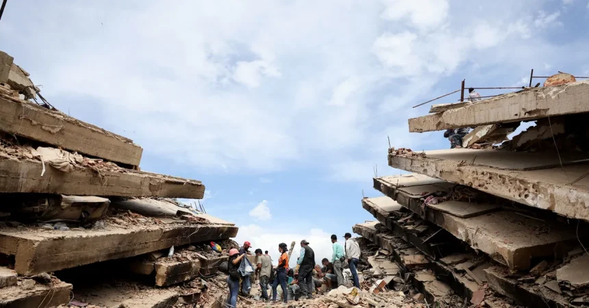
The recent double earthquake that struck Venezuela has left the nation in a state of profound shock, but modern technology is now offering a chillingly precise look at the raw power unleashed by the tectonic plates. Following the powerful 7.2 and 7.5 magnitude tremors that shook the region last week, the European Space Agency (ESA) released a satellite-generated map that peels back the curtain on the instability beneath the earth’s surface. By utilizing advanced radar data from the Copernicus Sentinel-1 satellites, scientists have managed to visualize the exact scale of the upheaval that triggered such widespread devastation. This isn’t a mere photograph taken from orbit; it is a complex data reconstruction that captures the physical “bruising” of the landscape in the aftermath of a catastrophic shift in the ground.
The science behind these images is as fascinating as it is technical. Unlike standard optical cameras that rely on light, the Sentinel-1 satellites act more like a rhythmic heartbeat, “illuminating” the Earth with radar pulses to measure the precise time it takes for a signal to bounce back. By comparing an observation captured on June 18—before the earth moved—with one taken on June 25, just hours after the disaster, researchers created what is known as an interferogram. This process allows them to detect infinitesimal shifts in the terrain that would be completely invisible to the naked eye. What we see on the screen is not just a digital map, but a ghostly imprint of the Earth’s crust buckling under immense pressure.
When looking at this map, the most striking features are the dense, repeating bands of color—a sequence of blue, green, yellow, and red that stretches across the northern landscape near Caracas. To the untrained eye, these might look like artistic waves, but they are actually a scale of measurement for disaster. Each complete cycle of colors represents a specific, measurable change in the distance between the satellite and the ground. The more colors bundled tightly together, the more radical the displacement of the earth. These patterns provide scientists with a visual language to understand where the ground surged, dipped, or cracked under the force of the tectonic energy that took so many people by surprise.
The epicenter of this destruction corresponds perfectly with these colorful bands, which trace the jagged path of the San Sebastián fault system. This major tectonic structure, already known for being the volatile backbone of northern Venezuela, was clearly the epicenter of the disruption. According to the ESA’s initial analysis, the crust shifted by as much as 30 centimeters—nearly 12 inches—in a matter of seconds. For a structure as gargantuan as the Earth’s crust to move that distance in such a short window is a testament to the sheer, terrifying power of the seismic event. This measurement isn’t just a number; it explains why buildings that seemed solid on June 23 were reduced to piles of rubble by midday on the 24th.
Beyond the satellite imagery and the complex graphs, there is a much more human story unfolding on the ground. As rescue teams continue to navigate the precarious ruins in places like Caraballeda, the satellite data serves as a stark reminder of the environmental toll caused by the disaster. The visual evidence of the displacement helps coordinate rescue efforts, as authorities gain a better understanding of how the land itself has changed, potentially alerting them to further instability in the terrain. While the technology is impressive, it does not diminish the gravity of the images coming from the ground: exhausted rescue workers laboring through debris to find survivors amidst the silence that follows such a violent event.
Ultimately, these satellite images bridge the gap between abstract geological forces and the tangible reality of human suffering. They transform a chaotic, frightening event into data that can eventually help engineers design more resilient structures or help local officials better prepare for the next seismic tremor. While the radar shows us the technical footprint of the San Sebastián fault’s movement, we are reminded that behind every colored band on that map is a community rebuilding their home, searching for loved ones, and processing the profound vulnerability that comes from living on a shifting planet. We are reminded, through this blend of space-age science and humanitarian tragedy, that while we can map the earth’s movements, we can only truly endure them by coming together.