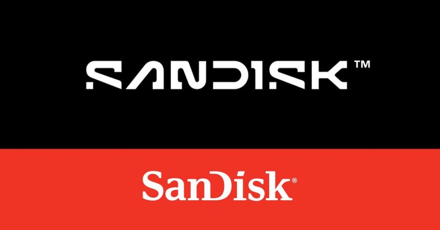
SanDisk, the renowned purveyor of flash memory storage solutions, has embarked on a transformative rebranding journey, unveiling a visually striking new logo that reimagines its brand identity for the modern era. This strategic move comes in anticipation of the company’s imminent spinoff from its parent company, Western Digital, slated for the following year. The rebranding signifies a fresh start for SanDisk as it prepares to navigate the market as an independent entity once more, following its acquisition by Western Digital in 2016. The new logo, inspired by the fundamental “pixel” or “single point of data,” departs from the inter-capped styling the company has employed since 1995, marking a decisive break from its past visual language.
The redesigned logo, as explained by SanDisk in a recently released video, embraces a bolder “slab serif” typeface while retaining the distinctive open “D,” a familiar element from its previous iterations. However, the most prominent change lies in the introduction of a pixel-inspired “S,” a modern and dynamic element that signals the company’s evolution and forward-thinking approach. SanDisk describes the symbiosis of the “S” and the “D” as representative of the collaborative spirit and partnerships that are crucial to achieving the company’s overarching purpose and unlocking new horizons of possibility. This design choice subtly yet powerfully conveys SanDisk’s commitment to innovation and its focus on the digital realm.
This rebranding initiative precedes SanDisk’s anticipated separation from Western Digital, a move that was initially planned for the current year but subsequently rescheduled. The spinoff represents a significant turning point for SanDisk, offering the company the opportunity to reclaim its independent status and chart its own course in the dynamic storage market. The timing of the rebranding strategically positions SanDisk to establish a distinct brand identity as it embarks on this new chapter. The refreshed visual language seeks to resonate with contemporary audiences and convey the company’s renewed focus and vision for the future.
The rebranding comes on the heels of a controversy that engulfed Western Digital last year concerning the SanDisk Extreme SSD, a high-performance portable storage device. Reports emerged detailing instances of data loss experienced by users of the product, raising concerns about its reliability. This incident, including a personal experience of data loss by a member of The Verge’s production team, coupled with Western Digital’s reluctance to address the issue publicly, cast a shadow over the company’s reputation. While the rebranding itself is unrelated to the controversy, it arrives at a time when SanDisk seeks to reaffirm its commitment to quality and reliability, essential attributes in the competitive storage market.
Despite the past controversy, The Verge expresses a positive reception towards SanDisk’s new logo, particularly appreciating the “unfinished” aesthetic. This design approach, characterized by a sense of incompleteness or deliberate asymmetry, has gained traction in recent years and is seen as a modern and dynamic design choice. The Verge’s positive assessment of the rebranding suggests that SanDisk has successfully navigated the complexities of visual identity redesign, achieving a balance between modernity and brand recognition. The comparison to other recent rebranding attempts, such as those by PayPal, Kia, Paramount, and Jaguar, further highlights SanDisk’s relative success in achieving a visually appealing and impactful update.
In essence, SanDisk’s rebranding represents a strategic move to reposition the company as it prepares for its independent future. The new logo, inspired by the fundamental unit of digital information, the pixel, signals a forward-looking approach and a commitment to innovation. While the rebranding follows a period of controversy surrounding a specific product, it is primarily driven by the upcoming spinoff from Western Digital and the need to establish a distinct brand identity. The positive reception by industry observers suggests that SanDisk has successfully achieved a modern and visually appealing refresh, positioning itself for renewed success in the ever-evolving storage market.


