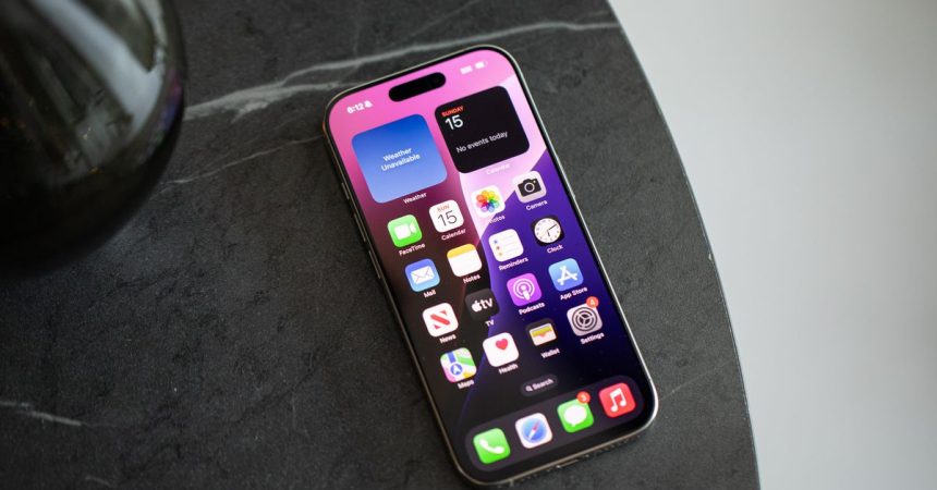
The familiar grid of app icons on our smartphones has long been the standard way we interact with our devices, a comfortable and seemingly logical organization system. However, as the number of apps we use continues to grow, this grid can become overwhelming, a cluttered and distracting mess of colorful squares vying for our attention. The constant presence of notification badges further exacerbates this issue, creating a sense of urgency and pulling us into the digital vortex. This grid, once a reasonable solution for managing a handful of apps, struggles to accommodate the dozens, even hundreds, that now populate our phones.
While Android has offered more flexibility in homescreen customization for some time, iOS users have been largely tethered to the grid. Recent iOS updates, however, have introduced widgets, an app library, and the ability to hide apps, offering a glimmer of hope for those seeking a less cluttered digital existence. iOS 18 takes this further, allowing for even more freedom in arranging apps and widgets, changing their appearance, and enhancing the Control Center. Despite these advancements, many of us cling to the familiar grid, hesitant to deviate from the default arrangement we’ve grown accustomed to.
Inspired by the potential of these new features and intrigued by the minimalist homescreens of others, a personal experiment in digital decluttering commenced. The goal was to pare down the homescreen to its essential elements, questioning the necessity of each app’s prominent placement. This involved removing frequently used apps whose functions were easily accessible through other means, such as the camera control and a daycare app launched via the action button. The result was a dramatically simplified homescreen, featuring only four apps in the dock and a few strategically placed widgets, a stark departure from the previous system of folders and emoji-labeled categories.
The initial trepidation of abandoning the grid quickly dissipated. The vast majority of apps were readily accessible through Siri suggestions or a quick search, rendering the rows of icons unnecessary. The most significant benefit of this minimalist approach was the reduction in notification-related distractions. While the absence of app icons and their badges meant occasionally missing notifications, it also eliminated the compulsion to constantly clear them, a significant source of distraction. This shift in focus from managing notifications to engaging with content when desired proved to be a liberating experience.
This personal journey towards a less cluttered homescreen is not unique. Others have embraced even more radical approaches, demonstrating the potential for customization and personalized organization. One example involves utilizing widgets and shortcuts almost exclusively, reserving app icons for only the most essential apps. This method prioritizes functionality and minimizes visual clutter, reducing the temptation to engage with distracting apps. The use of grayscale shortcut icons further enhances this minimalist aesthetic. This approach also allows for organization by action rather than app, providing a more intuitive and efficient workflow.
Another approach focuses on limiting the number of apps on the homescreen to a bare minimum, typically less than ten. This drastically reduces visual clutter and discourages mindless scrolling, promoting a more intentional and focused phone usage. While apps may be temporarily added for specific purposes, such as a road trip requiring navigation, the emphasis remains on maintaining a clean and distraction-free homescreen. These diverse approaches underscore the common desire for a less cluttered and more intentional digital experience.
The growing reliance on Spotlight search and the increasing accuracy of Siri app suggestions further highlight the evolving relationship with our smartphones. Many users, even those who maintain a traditional grid, now bypass the icons and opt for these more efficient methods of app access. This trend suggests a shift towards a more search-centric approach, where the homescreen serves less as a launchpad and more as a personalized information hub. This evolving landscape points to a future where AI and other technological advancements may further streamline our digital interactions. However, as this experiment demonstrates, we don’t have to wait for future innovations to improve our digital well-being. The tools are already at our disposal; all that’s required is the willingness to step outside our comfort zones and embrace new ways of interacting with our devices.


